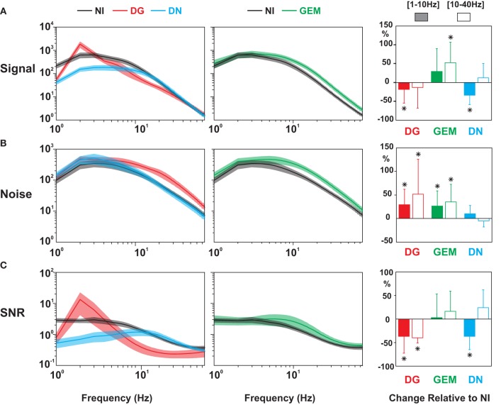
Figure 9.
Population analysis of the temporal power spectrum, for Signal, Noise, and Signal-to-Noise Ratio (SNR). Comparison of the average temporal power spectra of the Signal (top row), the Noise (middle) and the SNR (bottom) across protocols. For clarity, NI spectra (black) are displayed twice, on the left with DG (red) and DN (blue), and on the right with GEM (green) conditions. Shaded areas indicate ± 1 s.e.m. Same ordinates and temporal scales for (A–C). The right column represents the relative change in the power density for specific bands of temporal frequencies [(1–10 Hz) (shaded box) and (10–40 Hz) (empty box)] for three stimulus conditions (DG in red; GEM in green, DN in blue) relative to the NI case. Stars indicate a significant statistical difference with the NI condition (Wilcoxon paired test, p < 0.05). Note again that the broadband reconfiguration of the SNR spectrum in the NI and GEM conditions toward higher frequencies results from two different processes (Signal power increase for GEM, and Noise decrease for NI).

