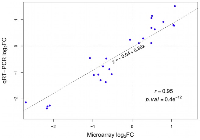
Figure 7. Validation of microarray results by qRT-PCR.

Log FCs from the microarray experiment are plotted on the x-axis, while log
 FCs from the qRT-PCR are plotted on the y-axis. qRT-PCR data was normalised to an index of the genes EF1
 and GAPDH. Expression levels of five different genes were compared. For each gene the log
 FCs for all five contrasts were calculated and plotted (as listed in Table S3). The dotted line represents the linear regression line. Pearson correlation and the corresponding p-value are displayed in the plot.
