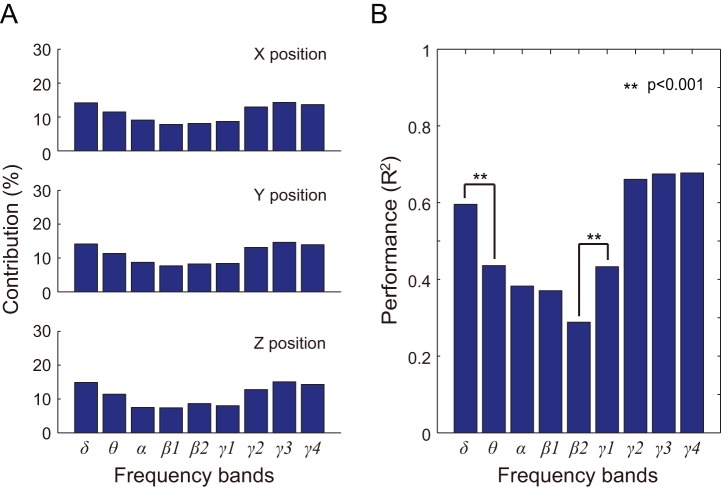
Figure 8. Contribution and performance of specific frequency bands for monkey B.
A) Each bar represents the weight of each frequency band in the PLS model. From top to bottom, the graphs depict contributions to X, Y, and Z positioning, respectively. B) Prediction results using each frequency band. We performed a two-way ANOVA with effects positioning and frequency bands. Each bar represents the mean R2 value of X, Y, and Z positioning when comparing observed and predicted hand trajectories. Significant differences between mean R2 values are denoted with * (p<0.001).

