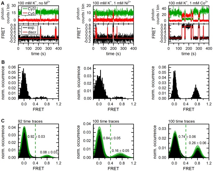
Figure 6. Representative time traces showing d3'EBS1*/IBS* interaction and thermodynamic analysis of FRET histograms (method 1).
(A) Fluorophore emission over time reveals abrupt anticorrelated changes in intensity (upper graphs). Calculation of FRET time traces reveals repetitive shuttling between a zero and a high FRET level (lower graphs). Based on the experimental design, these two states were assigned to the undocked and the docked state (Figure 1). The red lines correspond to the discretization by the Hidden Markov Model (vbFRET [25]). (B) FRET histograms built from the smFRET time traces shown in A. (C) Normalized cumulated FRET histograms built from individual time traces. The dashed green line depicts the threshold between the two FRET states used to determine the docked/undocked fractions and the normalized results are indicated. Solid green lines correspond to Gaussian approximation of the experimental data. The error (green swath) is the standard deviation associated with amplitude and width of the Gaussian fit functions as estimated by bootstrapping (3σ boba).

