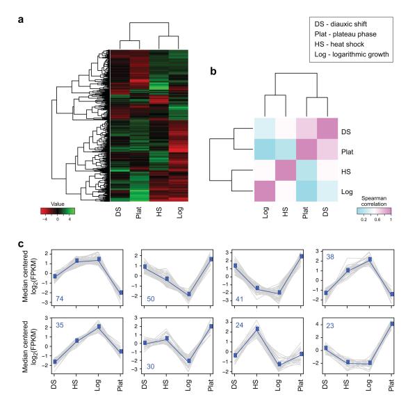
Figure 10. Comparisons of transcriptional profiles across samples.
(a) Hierarchical clustering of transcripts and samples. Shown is a heatmap showing the relative expression levels of each transcript (rows) in each sample (column). Rows and columns are hierarchically clustered. Expression values (FPKM) are log2 transformed and then median-centered by transcript. (b) Heatmap showing the hierarchically clustered Spearman correlation matrix resulting from comparing the transcript expression values (TMM-normalized FPKM) for each pair of samples. (c) Transcript clusters, extracted from the hierarchical clustering using R. X axis: samples (DS: diauxic shift; HS: heat shock; Log: mid-log growth; Plat: plateau growth); Y axis: median-centered log2(FPKM). Grey lines: individual transcripts; Blue line: average expression values per cluster. Number of transcripts in each cluster is shown in a left corner of each plot.

