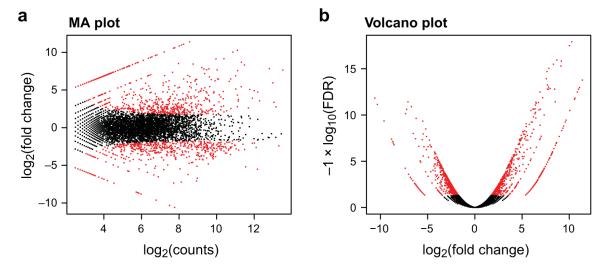
Figure 9. Pairwise comparisons of transcript abundance.
Shown are two visualizations for comparing transcript expression profiles between the logarithmic growth and plateau growth samples from S. pombe. (a) MA-plot for differential expression analysis generated by EdgeR, plots for each gene its log2(fold change) between the two samples (A, Y axis) vs. its log2(average expression) in the two samples (M, X axis). (b) Volcano plot comparing false discovery rate (-log10FDR, Y axis) as a function of log2(fold-change) between the samples (logFC, X axis). Transcripts that are identified as significantly differentially expressed at most 0.1% FDR are colored red.

