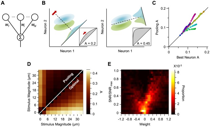
Figure 1. Population decoding.
A. Schematic representation of linear combination of neuronal activity by the downstream decoder. Coefficients  ,
,  and
and  represent the synaptic weights between the neurons (top row circles) and the decoder (bottom). B. Schematic representation of pooling (left panel) and optimal decoding (right panel). The green and blue ovals represent the joint distribution of the neurons' responses to two sensory stimuli. The solid black line represents the weight vector. The pooling method (left panel) is equivalent to a weight vector along the identity line. The bell-shaped areas on the weight vector represent the projection of the neuronal response distribution for each stimulus. Dashed lines correspond to the best criterion to discriminate the two stimuli. The insets show the hit rate versus false alarm rate (ROC) for every possible criterion, shading indicates area A. C. Average value of A for the pooled neuronal responses plotted against the average value of A for the best neuron. Various population sizes within a session are plotted with the same color and connected with a line. For each population size, the value of A is averaged across all possible selections of that size. D. The average value of A, for each stimulus pair, under pooling (upper triangle) and optimal decoding (lower triangle), across all populations of 8 single neurons. E. Histogram of the optimal weights as a function of the signal-to-noise ratio of the same neuronal populations as in D. The weights and SNR values are normalized to the best neuron in each population.

