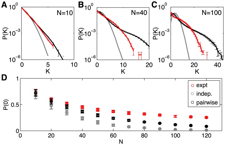
Figure 5. Predicted vs measured probability of K simultaneous spikes (spike synchrony).
(A–C)  for subnetworks of size
  ; error bars are s.d. across random halves of the duration of the experiment. For N = 10 we already see large deviations from an independent model, but these are captured by the pairwise model. At N = 40 (B), the pairwise models miss the tail of the distribution, where
  . At N = 100 (C), the deviations between the pairwise model and the data are more substantial. (D) The probability of silence in the network, as a function of population size; error bars are s.d. across 30 subgroups of a given size N. Throughout, red shows the data, grey the independent model, and black the pairwise model.

