
Figure 7. Predicted vs real connected three–point correlations,  from Eq (21).
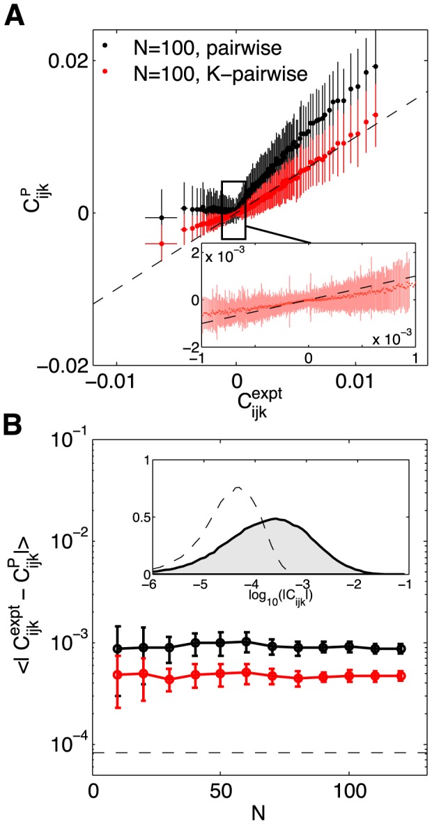
(A) Measured  (x-axis) vs predicted by the model (y-axis), shown for an example 100 neuron subnetwork. The ∼1.6×10⁵ triplets are binned into 1000 equally populated bins; error bars in x are s.d. across the bin. The corresponding values for the predictions are grouped together, yielding the mean and the s.d. of the prediction (y-axis). Inset shows a zoom-in of the central region, for the K-pairwise model. (B) Error in predicted three-point correlation functions as a function of subnetwork size N. Shown are mean absolute deviations of the model prediction from the data, for pairwise (black) and K-pairwise (red) models; error bars are s.d. across 30 subnetworks at each N, and the dashed line shows the mean absolute difference between two halves of the experiment. Inset shows the distribution of three–point correlations (grey filled region) and the distribution of differences between two halves of the experiment (dashed line); note the logarithmic scale.