
Figure 8. Predicted vs real distributions of energy, E.
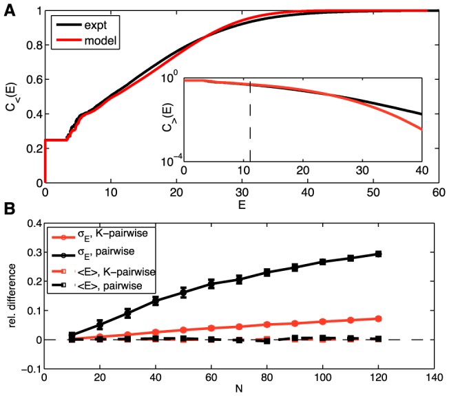
(A) The cumulative distribution of energies,  from Eq (22), for the K-pairwise models (red) and the data (black), in a population of 120 neurons. Inset shows the high energy tails of the distribution,
  from Eq (24); dashed line denotes the energy that corresponds to the probability of seeing the pattern once in an experiment. See Figure S5 for an analogous plot for the pairwise model. (B) Relative difference in the first two moments (mean,
  , dashed; standard deviation,
  , solid) of the distribution of energies evaluated over real data and a sample from the corresponding model (black = pairwise; red = K-pairwise). Error bars are s.d. over 30 subnetworks at a given size N.