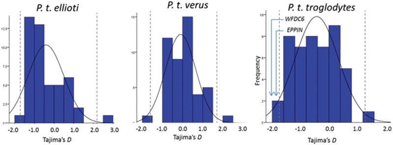
Fig. 4.—

Empirical comparisons generated from the 47 control regions. Tajima’s D (Tajima 1989) was calculated for each region using SLIDER and plotted with the 2.5 and 97.5 percentiles represented as dashed lines.

Empirical comparisons generated from the 47 control regions. Tajima’s D (Tajima 1989) was calculated for each region using SLIDER and plotted with the 2.5 and 97.5 percentiles represented as dashed lines.