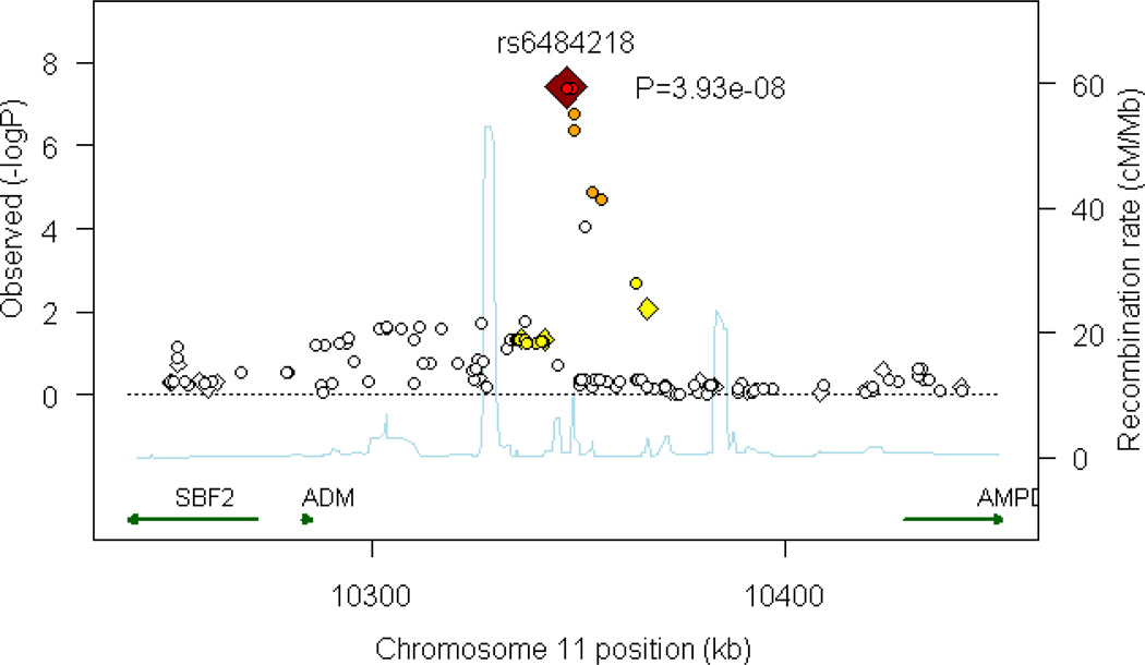
Figure 2.
Plot of region of strongest association. Results (–log10P) are shown for directly genotyped (diamonds) and imputed (circles) SNPs. The most associated SNP is shown in dark red, and the color of the remaining markers reflects the linkage disequilibrium (r2) with the top SNP in each panel (increasing red hue associated with increasing r2). The recombination rate (second y axis) is plotted in light blue and is based on the CEU HapMap population.

