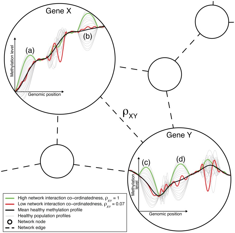
Figure 1. The DNA methylation network interaction measure.
A combination of the variation of the healthy methylation profiles in regions (a) and (b) of gene X explains well/is well-explained by a combination of the variation of the healthy methylation profiles in regions (c) and (d) of gene Y. The green cancer sample varies by a large amount about the mean methylation profile and in a typical way in these regions in both genes. Hence, the green sample corresponds to a high level of network interaction co-ordinatedness, as measured by the DNA methylation network interaction measure,  . The variation in the other regions of these genes do not well-explain each other, and so the red sample, which varies by a large amount in these other regions and varies less and in an atypical way in regions (a)–(d), corresponds to a low level of network interaction co-ordinatedness,
  . Genes X and Y are likely to have different numbers of methylation measurement locations (i.e., variables X and Y are of different dimension). The ordering of the measurement locations has no influence on the calculation of
  , as long as the ordering is consistent across samples.

