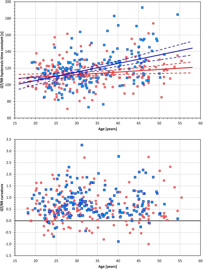
Fig. 4.
Top: scatter diagram between age and the QT/RR hysteresis time constant. The solid and dashed lines show linear regressions together with their 95% confidence intervals. Bottom: scatter diagram of age and QT/RR curvatures. In both graphs, red/pink circles represent women and blue/cyan squares represent men, respectively. The red and blue lines in the top graph correspond to female and male populations, respectively.

