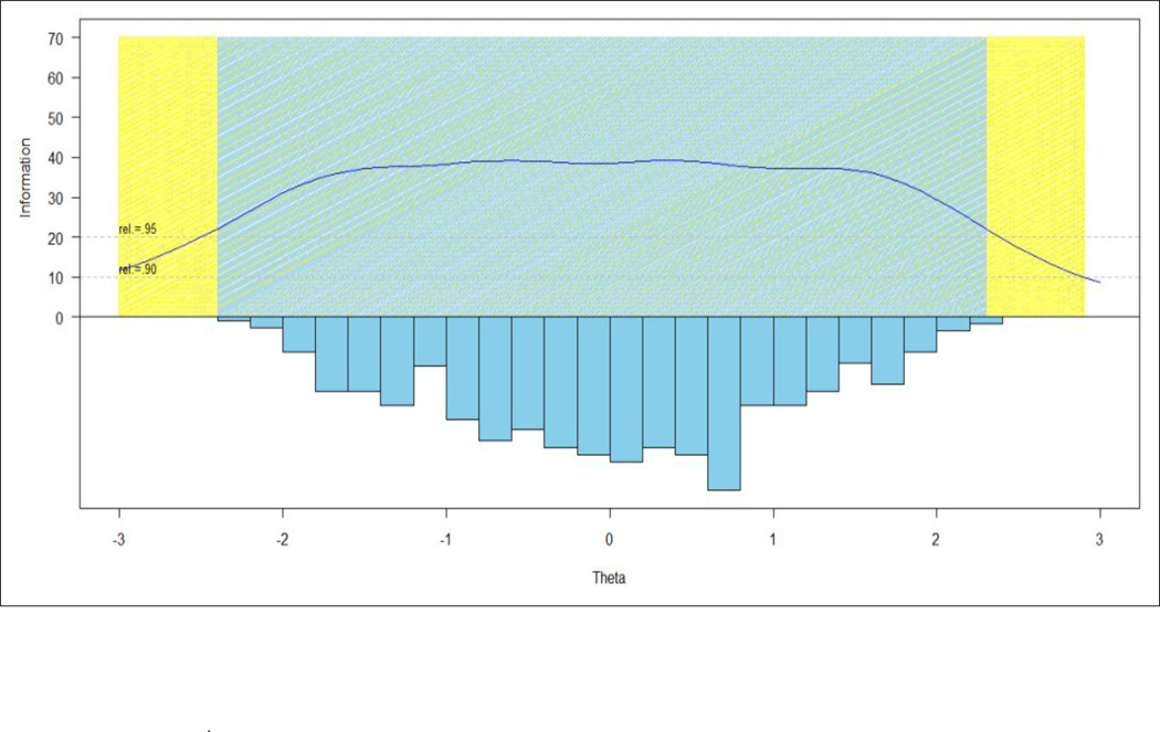
Figure 1.
Precision Levels across the Positive Affect Measurement Continuum
Note: In these figures, the Y-axis represents information function which was then converted to reliability function; X-axis is the IRT-scaled score (theta) where reliability of each score was estimated. The area plotted in blue is mean scores with a reliability ≥ 0.95. The area plotted in yellow represents mean scores with a reliability between 0.9(inclusive) and 0.95 (exclusive). The bottom half of the figure is the participants’ positive affect scores represented in histogram and the upper part of the figure is the information function curve of items, with the cut-off lines for a reliability of 0.95 and 0.90 plotted, respectively.

