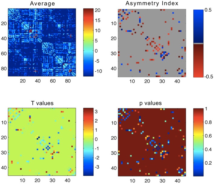
Figure 1.
Upper left panel: average connectivity matrix from all subjects – the scale bar represents log(connectivity weight). Upper right panel – link-wise average asymmetry index. Lower left panel – T values from a one-sample t-test evaluating the differences between the asymmetry indices and a distribution with mean = 0. Lower right panel – p values from the one-sample t-test. For all plots, the x- and y-axis represent ROIs numbered from 1 to 90 in accordance, where ROIs 1–45 are located in the left hemisphere, and 46–90 in the right hemisphere. The legend for ROI numbering can be seen in Table A1 in Appendix.

