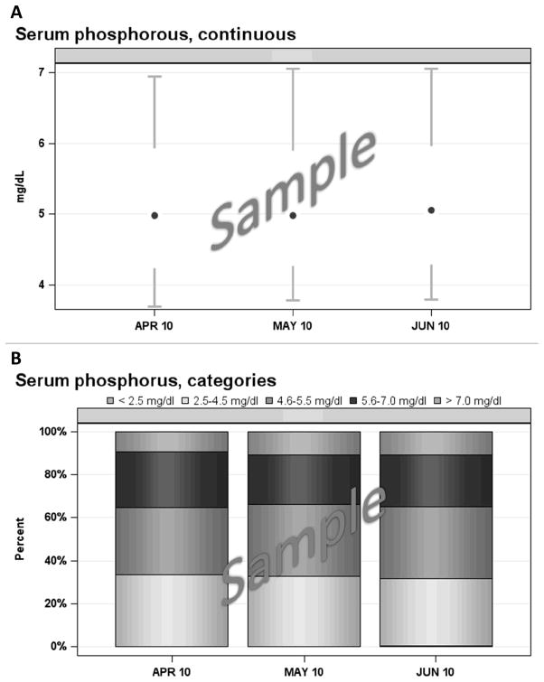
Figure 1. Examples of graphics used in the DPM reports.
Panel A: Sample Box-and-Whisker Chart (Modified)
At each time period on the X axis, the central dot represents the 50th percentile (median) of the distribution, the vertical line below the central dot connects the 10th and 25th percentile values, and the vertical line above the central dot connects the 75th and 90th percentile values. Additional statistics (mean, standard deviation, etc.) are provided in a separate data table (not shown). Values at each month are based on the average of at least two measurements obtained during the prior three months. Conversion factors for units: mg/dL to mmol/L, ×0.3229.
Panel B: Sample “Stacked” Column Chart
Segment heights represent the proportion of observations in each category at the time period indicated on the X axis. Values at each month are based on the average of at least two measurements obtained during the prior three months. Conversion factors for units: mg/dL to mmol/L, ×0.3229.

