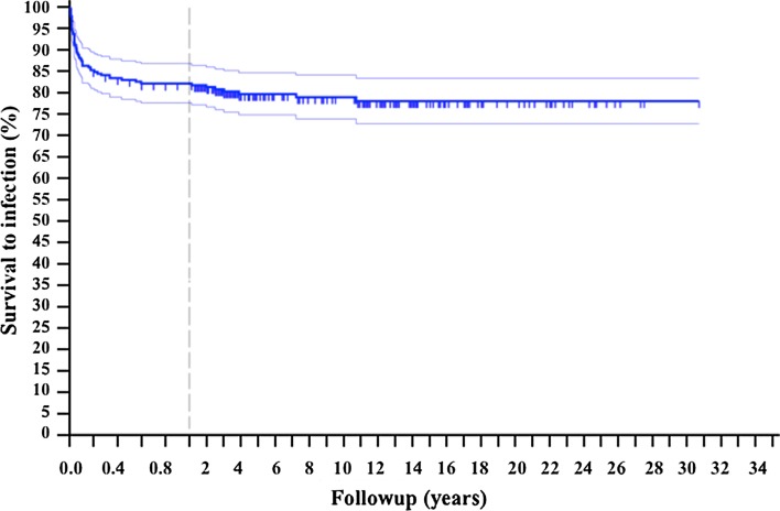
Fig. 1.
The Kaplan-Meier curve shows the overall survival to infection of the entire group. Patients were censored based on whether a deep infection was reported during followup. Considering that most of the events happened during the first year, the graph shows more accurately this range of followup.

