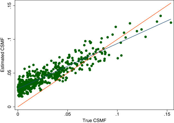
Figure 2.
Estimated cause-specific mortality fraction (CSMF) versus true CSMF example. A graphical example of the regression of the estimated over true CSMF. This particular example is for the estimation of epilepsy using SSP without HCE. Each dot represents a single split, or simulated population, and SSP’s estimate of fraction of epilepsy in the population as compared to the true fraction. The red line represents a perfect estimate while the blue line represents a line of best fit for the data. HCE, health care experience; SSP, Simplified Symptom Pattern.

