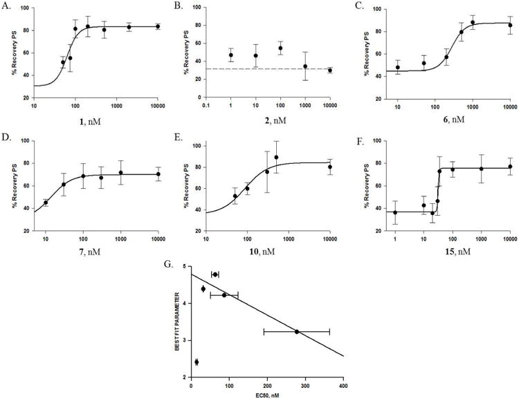
Figure 7.

The concentration-protection curves of representative cembranoids. Panels A-F show the concentration-protection curves for cembranoids: A. 1, B. 2, C. 6, D. 7, E. 10, and F. 15. The experimental protocol was described in General Experimental Procedures and Figure 2; the symbols represent the mean±SEM for the % recovery of the PS after exposure of the slice to DFP followed by the cembranoid at the indicated concentration (n=7-145). In A, C, D, E, and F, the line represents the best fit of the data to the equation: f=min + (max-min)/(1+(x/EC50)^(-Hillslope)), with the parameters indicated in Table 1; B. Cembranoid 2 had low activity and could not be fitted to a logistic equation; dashed line represents the % recovery of PS with DFP alone. G. Correlation between the Best Fit QSAR parameters (Table 2) and the EC50 values for active cembranoids. A linear correlation was observed for cembranoids 1, 6, 10, and 15 (yo = 4.8±0.2; slope = -0.0055±0.0015, regression coefficient = 0.93). Cembranoid 7 did not follow the same regression line; it had both smaller EC50 and smaller QSAR number compared to other cembranoids in the graph.
