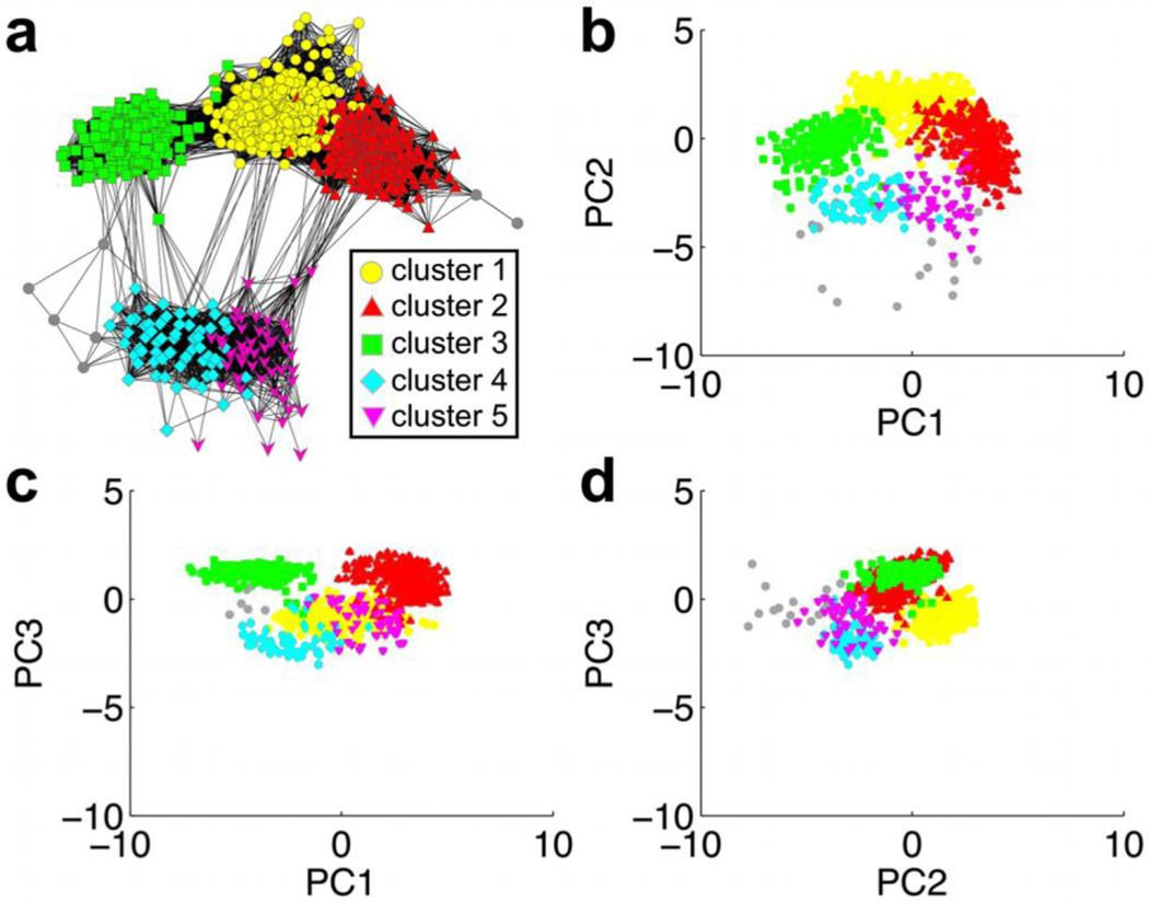
Figure 6.
Comparison of network visualization and PC conformer plots: (a) network, (b) PC1 vs. PC2, (c) PC1 vs. PC3, (d) PC2 vs. PC3. The five dominant clusters from the average linkage algorithm are mapped onto the network and PC plots by color. Grey nodes and points represent snapshots that were not assigned to one of the five major clusters. The covariance matrix and projections for PC analysis were computed with the AmberTools program ptraj (http://ambermd.org/) [39].

