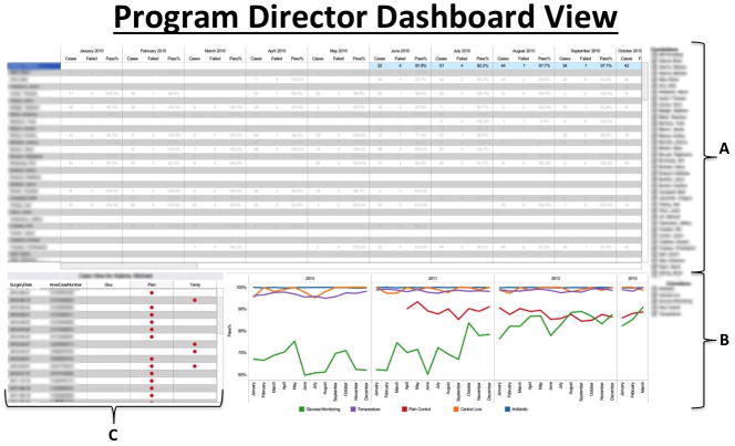
Figure 1.
This figure displays the Program Director dashboard view which is accessed through a password-protected website. The different panels comprising this dashboard show: A) tabular numerical listings of individual resident scores plotted by case pass/failure rate by month, with ‘pass/fail’ as a binary score taking into account passing on all 5 metrics or not; B) color-coded graphical representation of performance of all residents on each individual metric over time; and C) listings of individual cases in which occurred, with each row representing one case and the metric(s) failed in that case being depicted by the red dots. In this portion of the dashboard, a read-only version of the anesthesia record for a case in question can be accessed from our AIMS by clicking on the case (one row represents one case). Additionally, in panel ‘A’ in the figure, resident performance can be sorted by column in ascending or descending order, giving the program director immediate access to the residents that are top performers and those that are low performers on defined quality metrics. Thus, the Program Director can quickly assess individual resident performance and global programmatic performance from this one dashboard. [AIMS = Anesthesia Information Management System]

