
Figure 2.
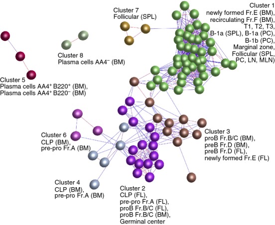
Clustering of samples based on their global gene expression profile. A Pearson correlation matrix was prepared by comparing data derived from all 84 samples. A network graph was then constructed using sample-to-sample relationships greater than r ≥ 0·85, and clustered using a Markov Clustering inflation value of 2·2. Here, the nodes represent samples (individual micro-array data sets) and each cluster of nodes is assigned a different colour. The edges represent the connections between data sets and are coloured according to the strength of the correlation (red, r = 1·0; blue, r ≥ 0·85). Full descriptions of the sources of each data set are given in Table S1. BM, bone marrow; FL, fetal liver; LN, lymph node; MLN, mesenteric lymph node; PC, peritoneal cavity; SPL, spleen.