
Figure 3.
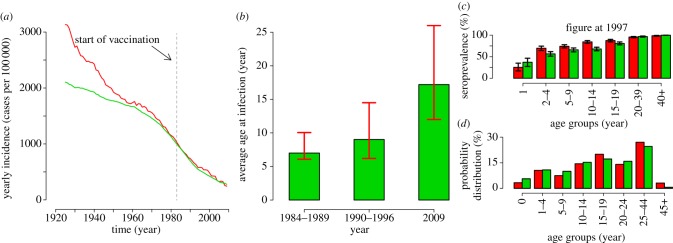
(a) Yearly measles incidence over time as reported to the statutory notification system (multiplied by the inverse of the estimated reporting rate, namely 7.4%; see the electronic supplementary material) averaged over a moving window of 15 years (red line, notification data) and the same quantity as predicted by the model (green line, model prediction). The vertical dashed grey line represents the year in which the Italian immunization programme started. (b) Average age at infection as predicted by the model in selected time window (green bars, predicted national average) compared with the range (minimum and maximum) of the median age at infection as observed in the different Italian regions (red lines, regional national average). (c) Average observed (red) and predicted (green) seroprevalence by age group in 1997. Black lines represent 95% CI as obtained from exact binomial test both for data and model simulations where the probability of being seropositive by age groups is the one predicted by the model and the sample size is the same as the actual serosurvey [17]. (d) Probability distribution of cases by age group in 2009 as reported to the surveillance system (red) and as predicted by the model (green).