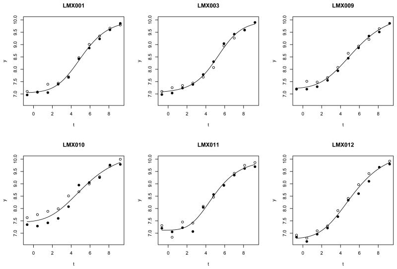
Figure 1.
Motivating dataset. Each panel represents the standard curve data from one plate. The x axis is the log transformed concentration, the y axis is the observed outcome. Two different plotting symbols are used to distinguish the two replicates within a plate. Each replicate comes from one dilution series.

