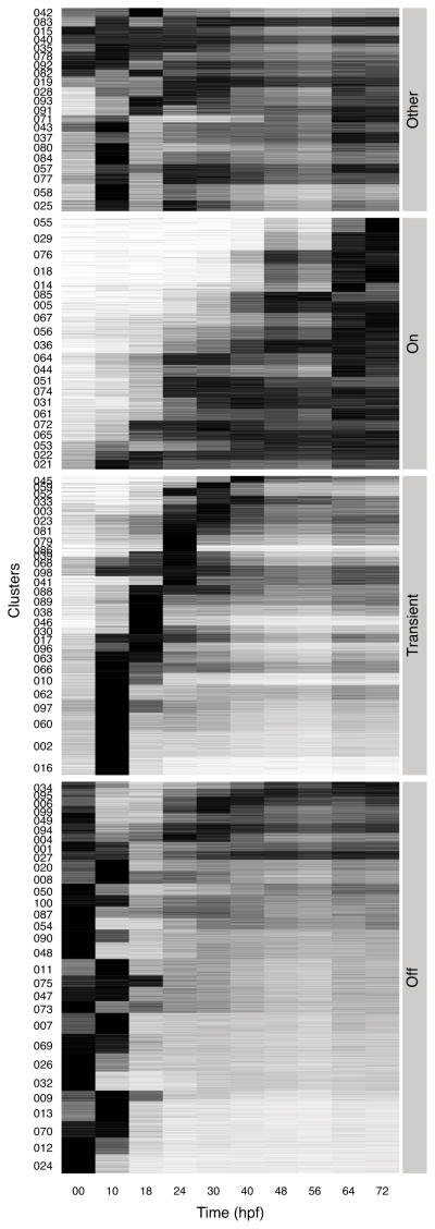
Figure 3.
Heatmap of relative expression profiles of embryonic genes. The transcript abundance of each gene is shown as a horizontal line and the lines are ordered by clusters. The ordinate shows IDs of clusters. The clusters are divided into four major groups. The abscissa gives developmental stages in terms of hours post fertilization. The density indicates the abundance relative to the maximum value for the given gene during embryonic development. Black is maximum and white is zero. See also Figure S2 and Figure S3.

