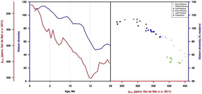
Figure 13. Diatom diversity vs estimated atmospheric pCO2 for the last 20 Ma.
a) Three point moving average of three diatom diversity time series estimates from figure 7 (blue line) vs time series of estimated pCO2 [31] (red line). b) Diatom diversity vs pCO2. Symbols as in figure 11. Age scale: [43].

