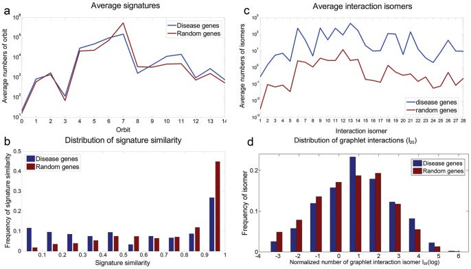
Figure 3. Compare disease genes with random genes using graphlet signature and graphlet interaction.
Graphlet signature and graphlet interaction were applied and compared to distinguish the disease genes and random picked genes. a. The average signatures of disease genes (blue line) and random genes (red line); b. The distribution of graphlet signature similarities between disease genes (blue bars) and between random genes (red bars). The horizontal axis which was discretized to 10 grids represented the similarity from 0 to 1 and the longitude axis was the number of the gene pairs with corresponding similarities; c. The average number of graphlet interaction isomers between disease gene pairs (blue line) and random gene pairs (red line); d. The distribution of average graphlet interaction isomer I20 of disease gene (blue bars) and random genes (red bars). The horizontal axis was the logarithmic number of the isomer, and the longitude axis was the normalized number of genes which had corresponding number of isomers.

