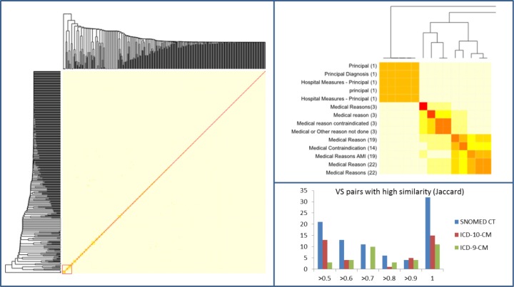
Figure 6.
Pairwise similarity of SNOMED CT value sets. Left: The heat map shows a low similarity among value sets overall. Right, top: The detailed view reveals local clusters of high similarity for the part marked with a red square in the heat map on the left. Right, bottom: Number of value set pairs with a high similarity for SNOMED CT and ICD value sets.

