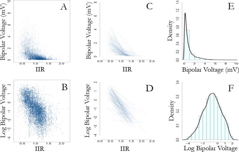
Figure 4. Distribution of voltage measures.
The figure illustrates that log transformation of bipolar voltage measures accommodates modeling within a linear framework. Panel A shows a scatter plot of bipolar voltage measures against corresponding IIR values. In contrast, panel B shows the scatter plot of log transformed bipolar voltage measures versus corresponding IIR values. Panels C and D compare spaghetti plots (individual regression lines for patients) of bipolar voltage and log transformed bipolar voltage, respectively, versus the IIR values. Panel E shows the skewed distribution of bipolar voltage measures. In contrast, panel F shows the normal distribution of the log transformed bipolar voltage measures.

