
Figure 1.
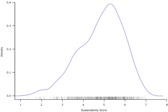
Density plot (frequency) of the variability of Program Sustainability Assessment Tool (PSAT) scores across 252 public health programs participating in tests of the PSAT.
Official websites use .gov
A
.gov website belongs to an official
government organization in the United States.
Secure .gov websites use HTTPS
A lock (
) or https:// means you've safely
connected to the .gov website. Share sensitive
information only on official, secure websites.
Density plot (frequency) of the variability of Program Sustainability Assessment Tool (PSAT) scores across 252 public health programs participating in tests of the PSAT.