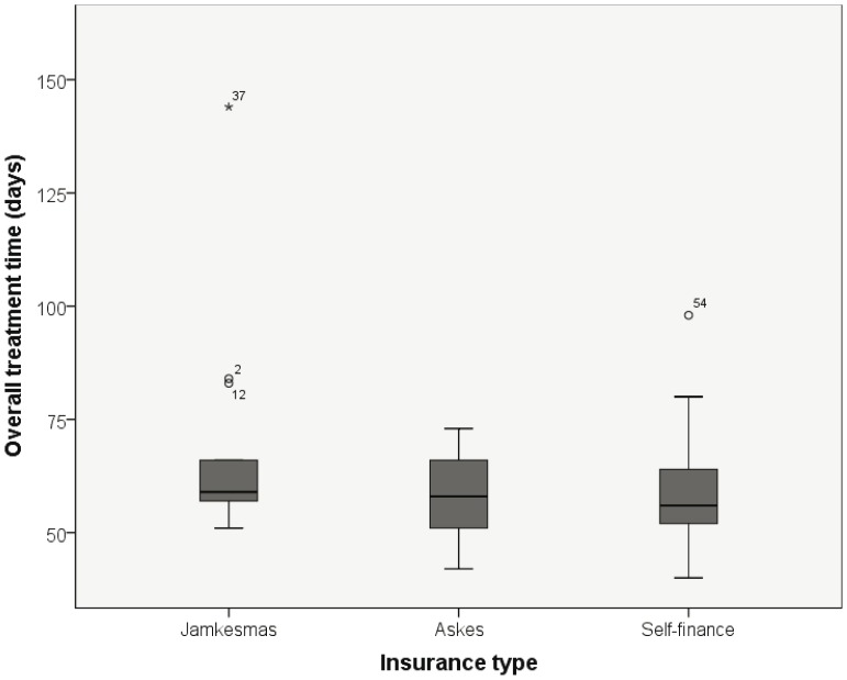
Figure 2. Distribution of overall treatment time and insurance type.
The dark line in the middle of the boxes is the median. The bottom and top of the boxes indicate the 25th and the 75th percentile. The T-bars are the inner fences of all subjects and extend to a maximum of 1.5 times the inter quartile range. * are outliers until 3 times the inter quartile range. 0 are outliers exceeding 3 times the quartile range.

