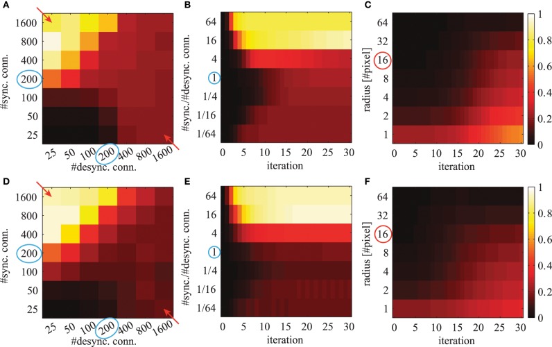
Figure 9.
The averaged local phase synchrony in circular image regions for different simulation parameters. All evaluations are based on the activation levels obtained from the image shown in Figure 8A. Simulations in the top row (A–C) are based on Gabor weights; simulations in the bottom row (D–F) are based on autoencoder weights. Blue circles indicate the standard parameters for subsequent evaluations. Colorbars of all panels are the same and shown on the right. The panels in the left column (A,D) show the phase synchrony after 20 iterations for different number of excitatory and inhibitory phase connections per neuron. The panels in the center column (B,E) show the phase synchrony for different ratios of excitatory to inhibitory connections as a function of network iterations. These ratios correspond to the diagonal elements marked with red arrows in panels (A,D). And the shown time course of the average phase synchrony values are from the same simulations. In the right panels (C,F) the phase synchrony is shown for different sizes of the local circular region of the evaluations. The red circle indicates the radius which was used in the evaluations shown in the other panels.

