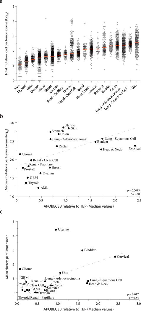
Figure 4. APOBEC3B expression levels correlate with total mutation loads and kataegis events.
(a) A dot plot showing the total mutation loads for each tumor exome from each of the indicated cancers. Each data point represents one tumor, and the Y-axis is log-transformed for better visualization. A red horizontal line shows the median mutation load for each cancer type.
(b) Median mutation loads per tumor exome for each cancer type plotted against the median APOBEC3B relative to TBP expression values (Spearman p = 0.0013, r = 0.68). Dashed grey line is the best-fit for visualization.
(c) The mean number of cytosine mutation clusters per exome for each cancer type plotted against median APOBEC3B relative to TBP expression values (Spearman p = 0.0017, r = 0.54). Dashed grey line is the best-fit for visualization.

