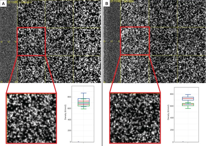
Figure 4.
Comparison of cluster sizes between SI and LI libraries. An example image from sequencing a SI library is shown in (A), along with a cluster density plot from Illumina’s Sequence Analysis Viewer. An example image and cluster density plot from sequencing a LI library is shown in (B). In each cluster density plot, the blue boxes represent total densities and the green boxes represent PF cluster densities. Red lines demarcate the median for the total density and the PF density.

