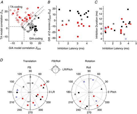
Figure 8. Summary of translation/rotation response properties of NU-target cells.

A, scatter plot of z-scores, showing partial correlation coefficients for each cell’s response fit with TA and GIA models. The superimposed dashed lines divide the plots into three regions: a top left area corresponding to cell responses with a significantly better fit (P < 0.01) by the TA model (red symbols), a bottom right area that includes neurons significantly better fit by the GIA model (black symbols) and an in-between area that includes cells not significantly better fit by either model (grey symbols). Filled symbols: NU-target cells. Open diamonds: VN data from Angelaki et al. ()2004, shown for comparison. B, scatter plot of the difference in z-scores between the TA and GIA models (ZGIA– ZTA) vs. inhibition latency. C, scatter plot of inhibition duration vs. inhibition latency for non-EM cells colour-coded as in A. D, polar plots of preferred vector orientations (i.e. directions of maximum response gain) of NU-target neurons during horizontal plane translation (left) and vertical plane rotations (right), colour-coded as in A. The distance of each symbol from the centre indicates its gain (in units of spikes/s/g for translation and spikes/s/deg/s for rotation), whereas the angular position of each symbol corresponds to its preferred vector orientation (FB, forward–backward translation; LR, lateral translation). Blue open symbols in C and D indicate cells not tested with combinations of translation and rotation (thus not classified as TA- or GIA-selective). Different symbols represent data from different animals.
