Figure 5.
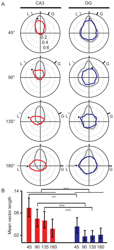
Quantifying input and output representations. (A) Polar plots were created from the spatial correlation matrices to represent the population activity between standard-1 vs. standard-2 (grey) and standard vs. mismatch (color) sessions. Each polar plot was created by calculating the average correlation along each diagonal of the corresponding correlation matrix to convert the 2D matrix into a 1D polar plot. The grey and black tick marks labeled “L” and “G” indicate the rotation angles of the local and global cue sets, respectively. The black dots indicate the angle at which the population correlations for the Std-Mis comparisons were maximum. For CA3, the maximum correlations closely followed the rotation of the local cues. (B) Mean vectors were calculated to quantify the coherence of the representations between sessions. Error bars represent the 95% confidence interval calculated with a bootstrap analysis. Collapsed across mismatch angles, CA3 had significantly larger mean vectors than its DG input. With respect to individual mismatch angles, the CA3 mean vectors were significantly larger than the DG mean vectors for the 45°. 90°, and 135° angles. ***, p < .001; **, p < .002.

