
Fig. 4.
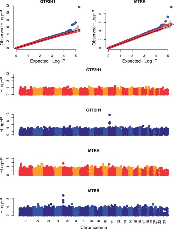
Quantile-Quantile (QQ) plots of observed versus expected −log P-value (top row) and Manhattan plots of −log P-value versus genomic position (bottom four rows) for all genotypes tested for associations with the genes GTF2H1 and MTRR. The gray bands in the QQ plots correspond to the 95% confidence interval of the order statistics. The P-values for HEFT (blue points) indicate a cis-eQTL for these two genes that were not indicated by the P-values of a linear regression (red and orange/yellow points)