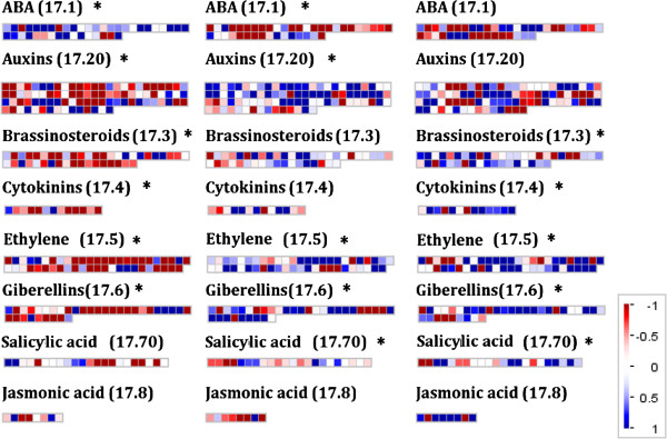
Figure 6.
Mapman diagrams for pairwise comparisons of hormone synthesis gene expression data. (Log(2)FC) at different time points (from – to). Diagram shows comparisons in mature leaves, where blue is increased expression and red is decreased. The data is divided between Mapman Bin codes corresponding hormone synthesis pathway genes, which were identified as being enriched from Mapman Wilcoxon rank sum test. The plots show the hormone synthesis group and the relevant Bin code (17.×) and * to indicated significant enrichment or not. Each square represent s a single gene.

