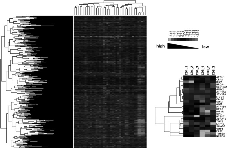
FIG. 3.
Hierarchical clustering diagrams. Left panel represents the whole function classification diagram of genes across all the samples. The hierarchical clustering result of overlapping DEGs in CD4+ and CD8+ T cells is shown in the right panel. The relative levels of gene expression are depicted with a color scale where gray represents a low expression level and white represents a high expression level.

