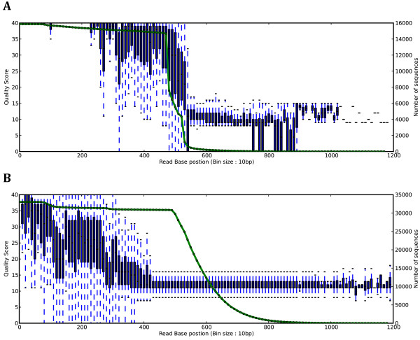
Figure 2.
Box and whisker plots showing an overview of the high quality (A) and low quality (B) data used for comparisons in this study. The x-axis corresponds to the read base positions (sampled every 10 bp for clarity) while the y-axis corresponds to the quality score. The second y-axis (associated with the green line) corresponds to the read coverage at each of the positions.

