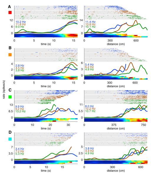
Figure 7. Hippocampal Coding for Time and Distance.
Examples of two cells that were more strongly influenced by time (A and B) and two cells that were more strongly influenced by distance (C and D). For each neuron, the same firing activity is plotted both as a function of time since the treadmill started (left panels) and distance traveled on the treadmill (right panels). Blue, brown, and green ticks (and tuning curves) represent the slowest 1/3 of runs, middle 1/3 of runs, and fastest 1/3 of runs, respectively. Numbers in blue, brown, and green indicate the peak firing rate in spikes per second (Hz) of the corresponding group of runs. The rows in the raster plots represent treadmill runs sorted in order of slowest speed (on top) to fastest speed (on bottom). Colored squares to the left edge of each neuron correspond to colored squares in Figures 8A and S3. See Figure S2 for additional examples. The activity of these neurons on the remainder of the maze can be seen in Figure S3.

