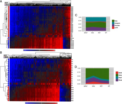
Figure 3.
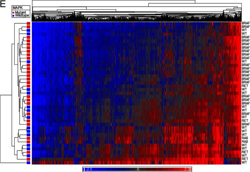
Heat maps comparing methylome of normal thyroid with MAPK mutant tumors (A) and MAPK WT tumors (B). Blue represents hypomethylated loci, and red represents hypermethylation. C, Distribution of differentially methylated CpG sites between promoter, gene body, 3′UTR, and intergenic regions based on driver mutation status. D, Distribution of differentially methylated sites relative to CpG islands based on driver mutation status. E, Heat map demonstrating differential methylation between MAPK mutant and MAPK WT tumor samples.


