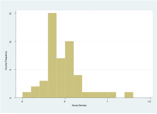
Figure 2.
Public sector nurse density by county frequency. The frequencies of the public sector nurse to population densities across the counties (n = 47) are shown. The vertical axis of the histogram represents the county frequency while the horizontal axis represents the public sector nursing densities per 1,000 population.

