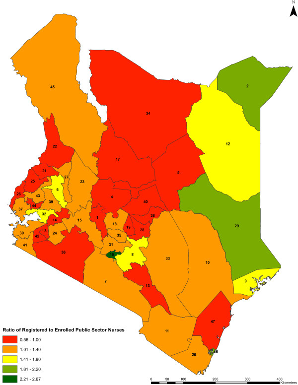
Figure 6.
Ratio of registered to enrolled public sector nurses by county. The ratios of registered nurses to enrolled nurses in the public sector across the counties (n = 47) are shown. The colors indicate the different range of values of the qualification ratios in the counties, while the counties are represented by county identification numbers ranging from 1 to 47.

