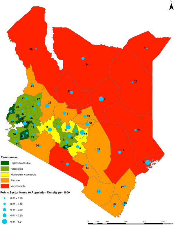
Figure 8.
Public sector nurse to population density against remoteness level by county. The public sector nursing densities per 1,000 population across the counties against the remoteness levels of the counties (n = 47) are shown. The colors indicate different range of values representing the remoteness levels of the counties, from highly accessible counties being shown in dark green to very remote counties being shown in red. The nursing densities are represented by blue circles of different sizes which are based on the different range of values of the densities, while the counties are represented by county identification numbers ranging from 1 to 47.

