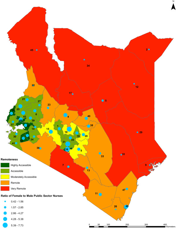
Figure 9.
Ratio of female to male public sector nurses against remoteness level by county. The gender ratios of female nurses to male nurses in the public sector across the counties against the remoteness levels of the counties (n = 47) are shown. The colors indicate the value ranges representing the remoteness levels of the counties, from highly accessible counties being shown in dark green to very remote counties being shown in red. The gender ratios are represented by blue circles of different sizes which are based on the value ranges of the ratios, while the counties are represented by county identification numbers ranging from 1 to 47.

