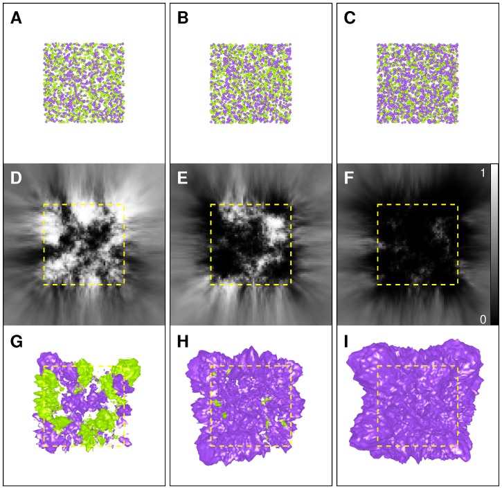
Figure 4. Spatial comparison of homogeneous Poisson point processes.
Each column displays data corresponding to a given sample pair ( ). A–C: typical patterns of Sample 1 (green) and Sample 2 (purple), with an average of
  points per pattern, and an average of
  points per pattern, with
  (A),
(A),  (B), and
  (C). D–F: mid-sections of
  -maps computed from Sample 1 and Sample 2, using
  . G–I: isosurfaces computed from
  -maps for thresholds equal to
  (purple) and
  (green) (
 ). Yellow dotted square in D–I: outline of the unit cube containing generated points.

