
Figure 5.
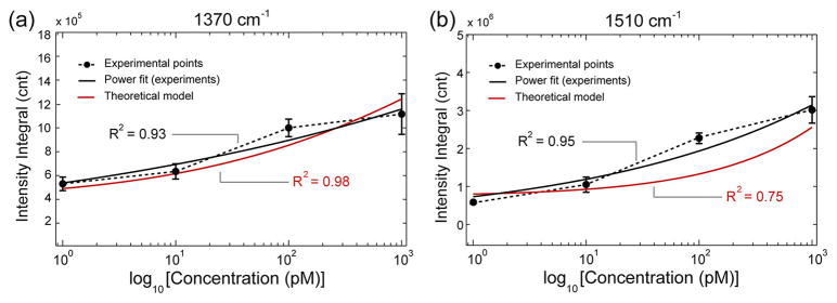
Experimental hotspot intensity integral plots for the diagnostic TVP peaks, (a) 1370 cm−1 and (b) 1510 cm−1, as a function of analyte concentration on a semilog scale (dotted curves). The error bars represent 2 standard deviations on three different samples for the same concentration. Both curves fit power functions (solid black lines). The red curves are calculated from the hotspot intensity distribution of mapping experiments using the statistical model of eq 4.