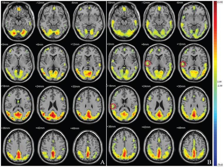
Figure 1. Mean ReHo maps within the ESRD group (A) and healthy controls (B).
Left side of the images corresponds to the right side of the subjects. T-score bars are shown on the right. The images illustrate high ReHo in the default network. In the controls group but not the patient group, high ReHo was shown in the right middle temporal gyrus.

